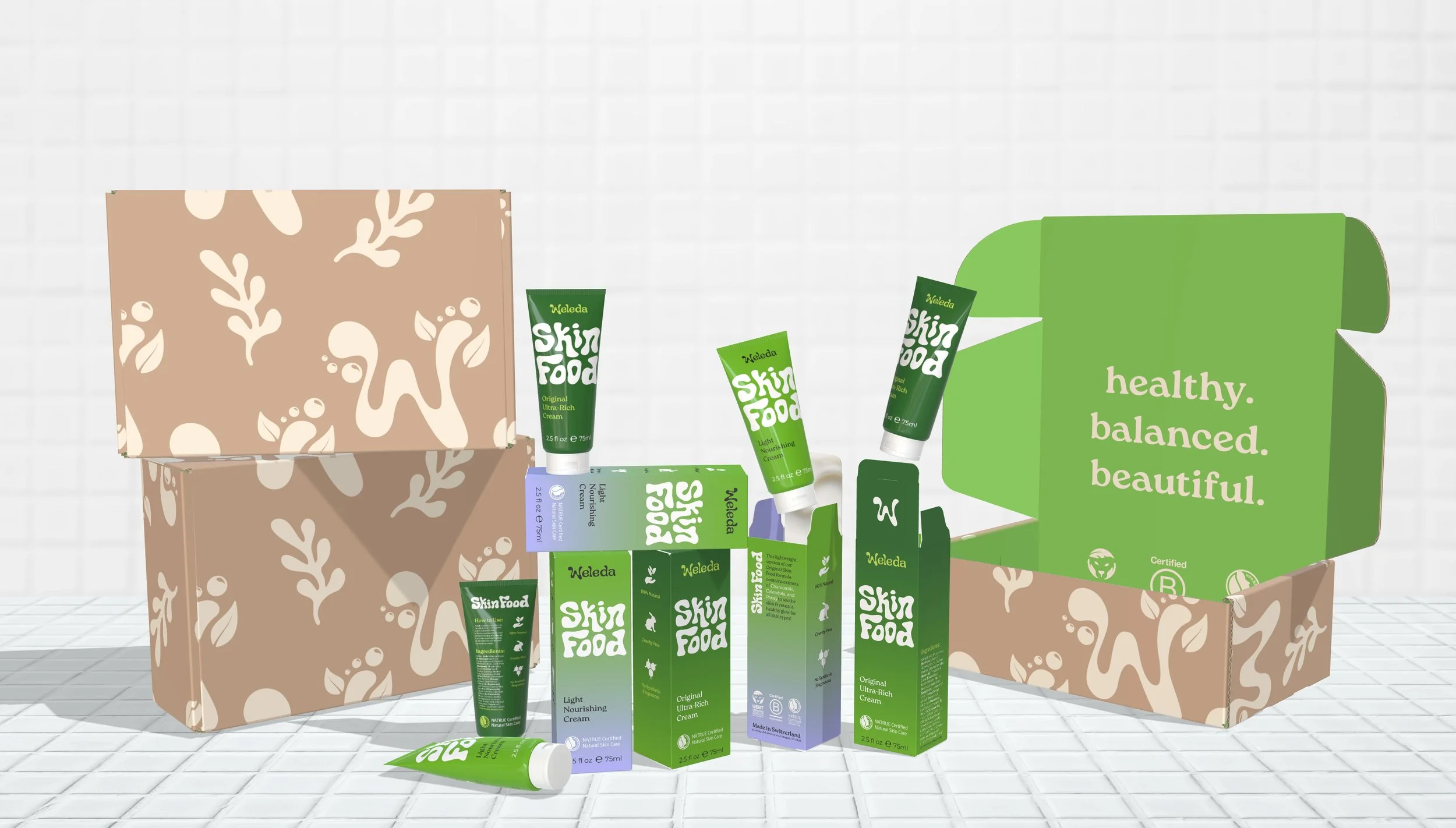

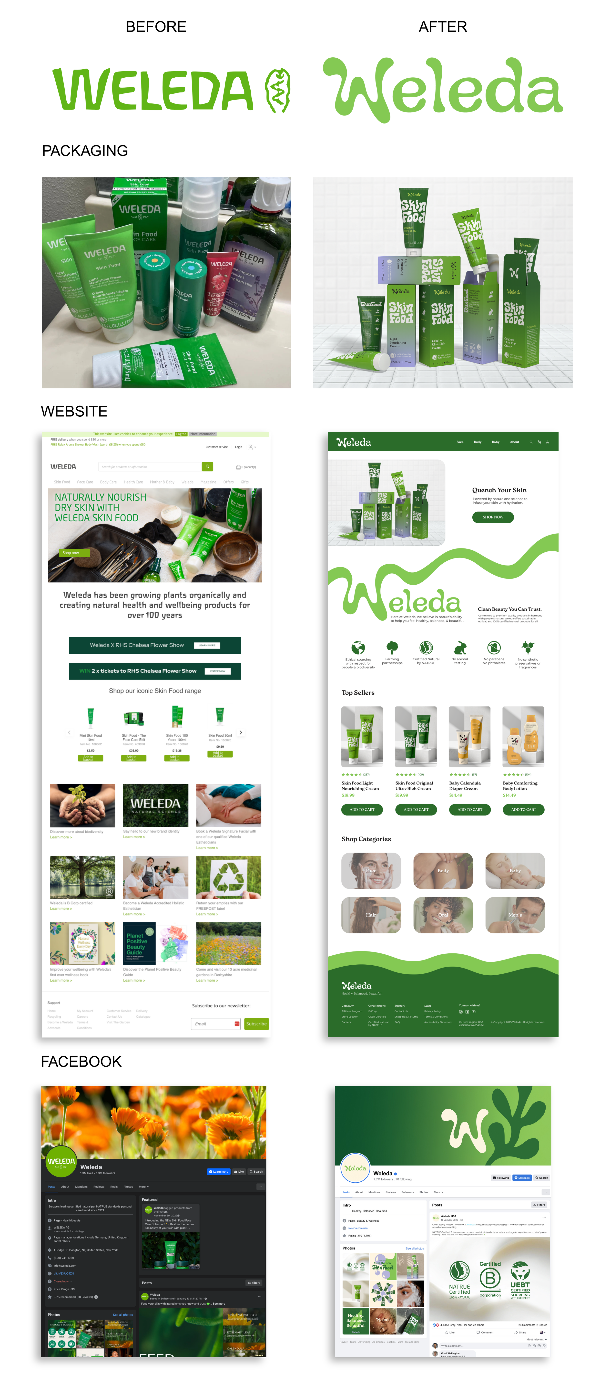
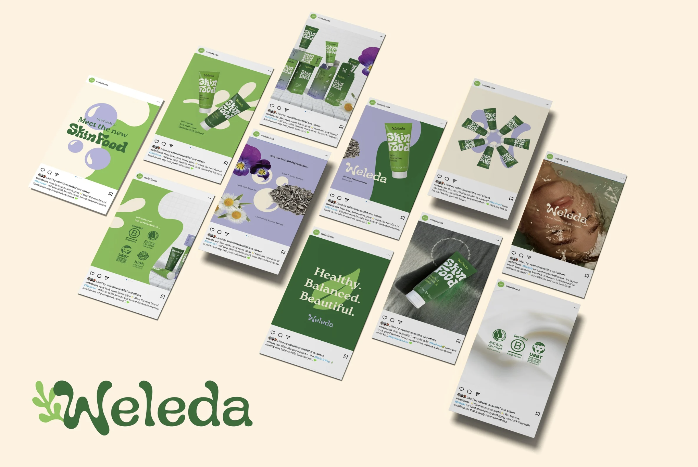
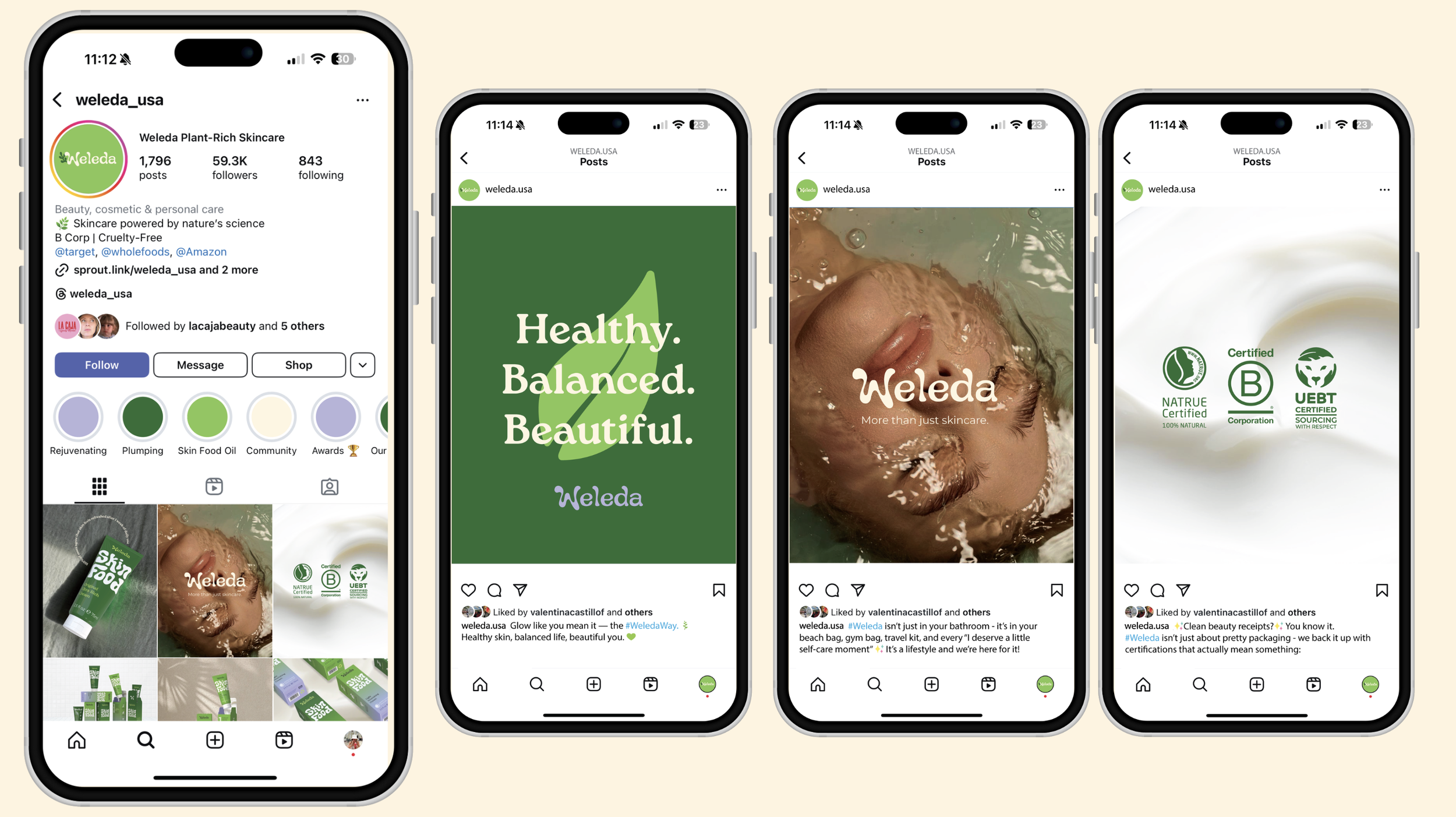
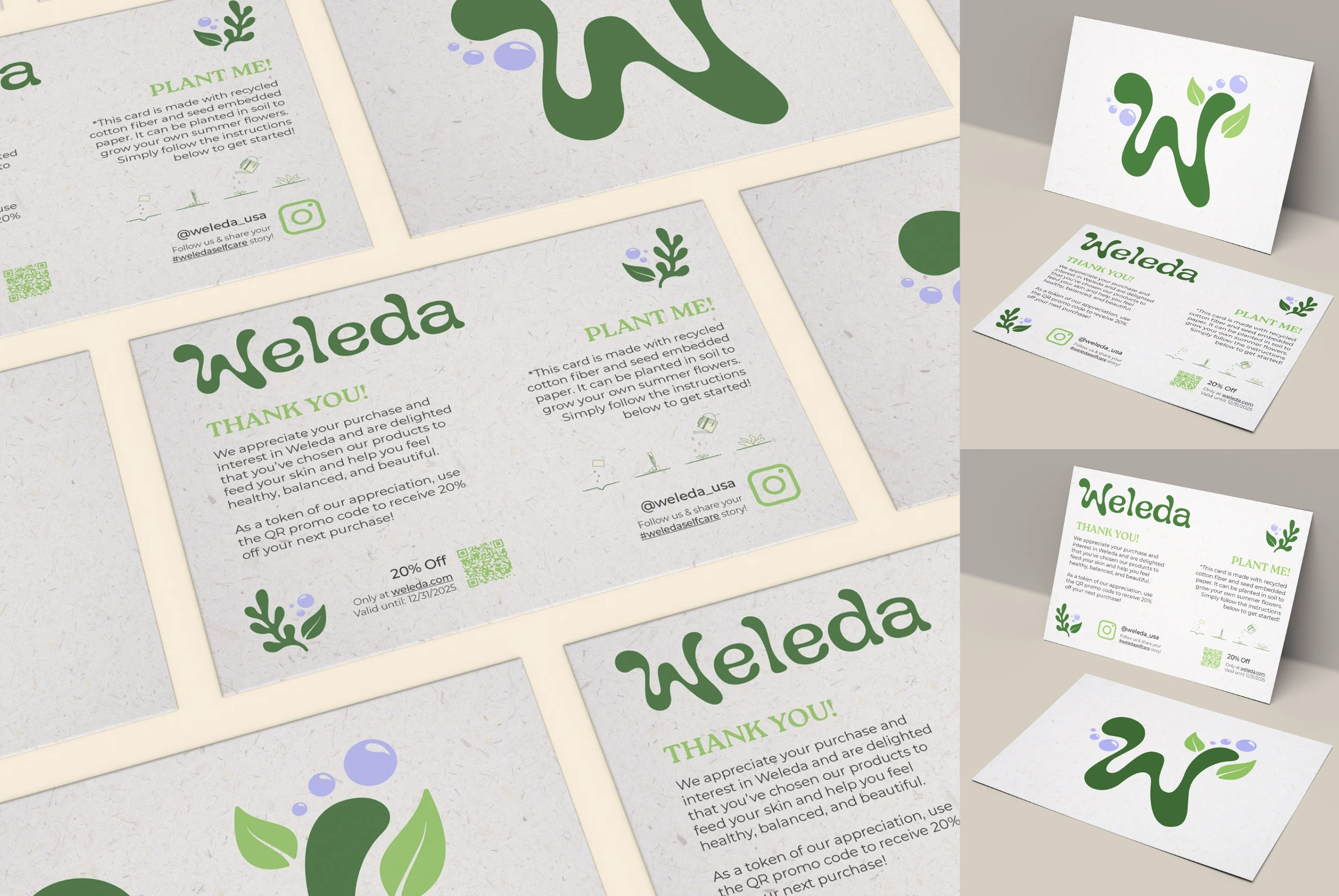
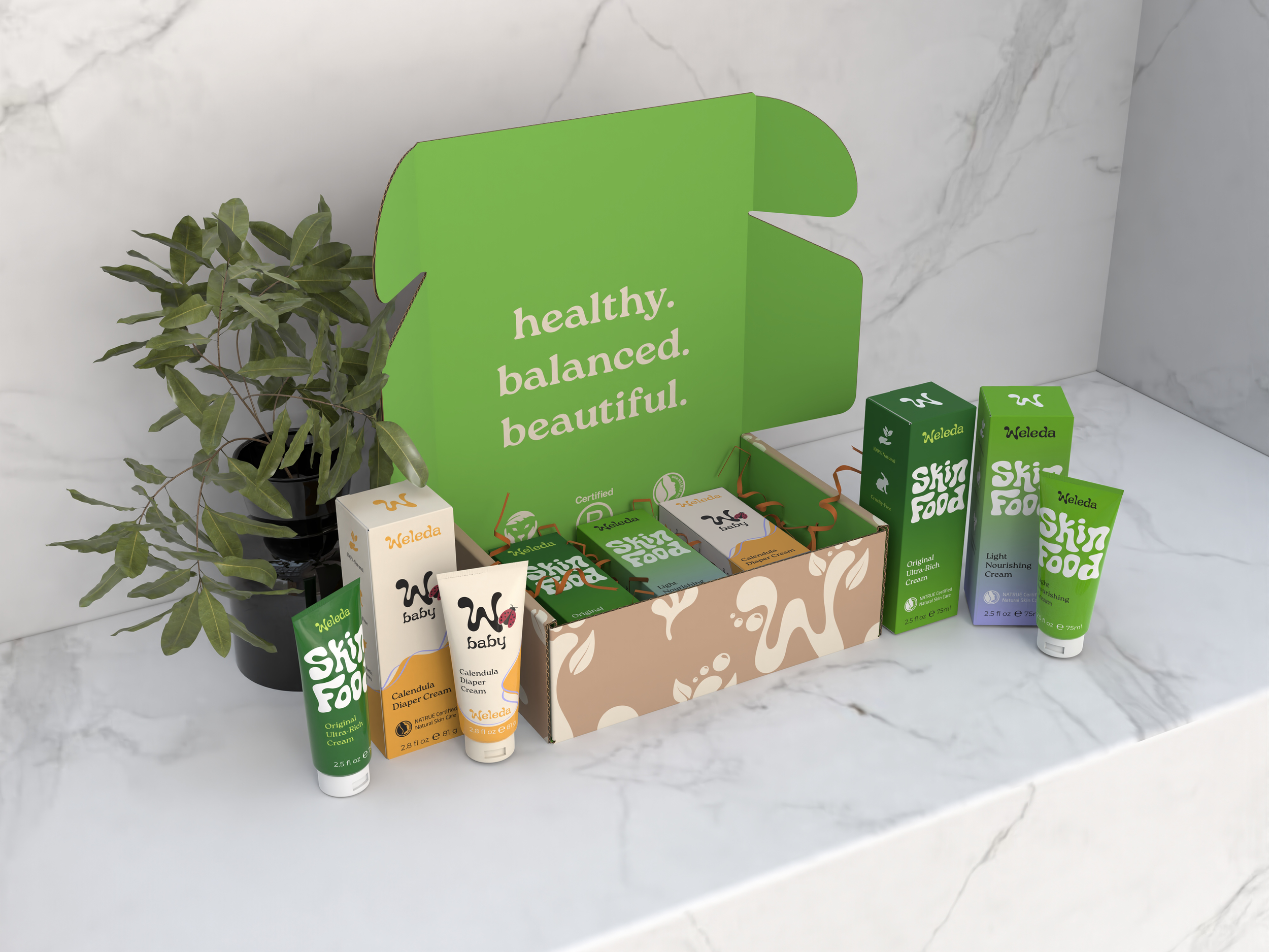
Faced with a declining global revenue and low brand awareness, Weleda needed to be revived with a new strategy and identity. Our goal was to zero-in on North America for this concept campaign and use their #1 seller, Skin Food, as the first step in reintroducing a refreshed Weleda to a younger consumer market while still embodying their brand values.
Design Process:
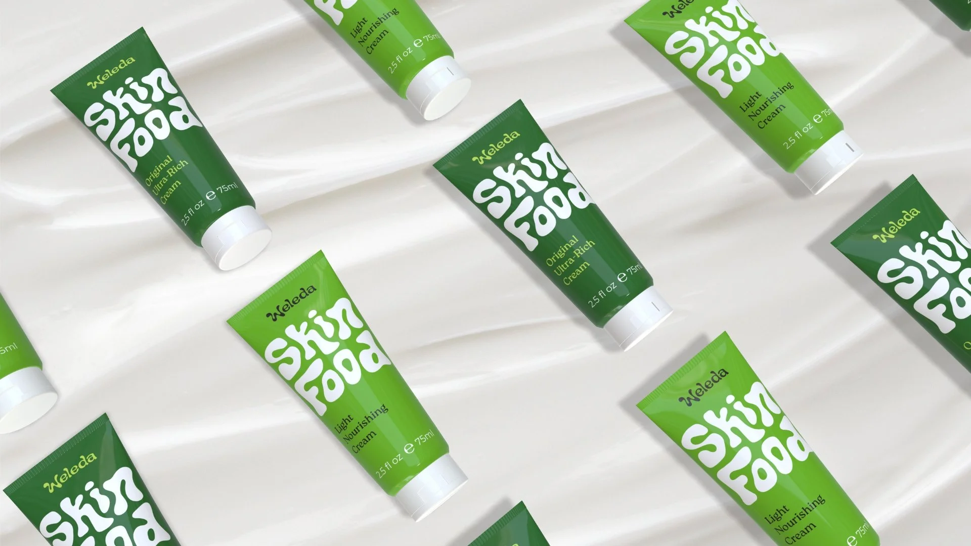
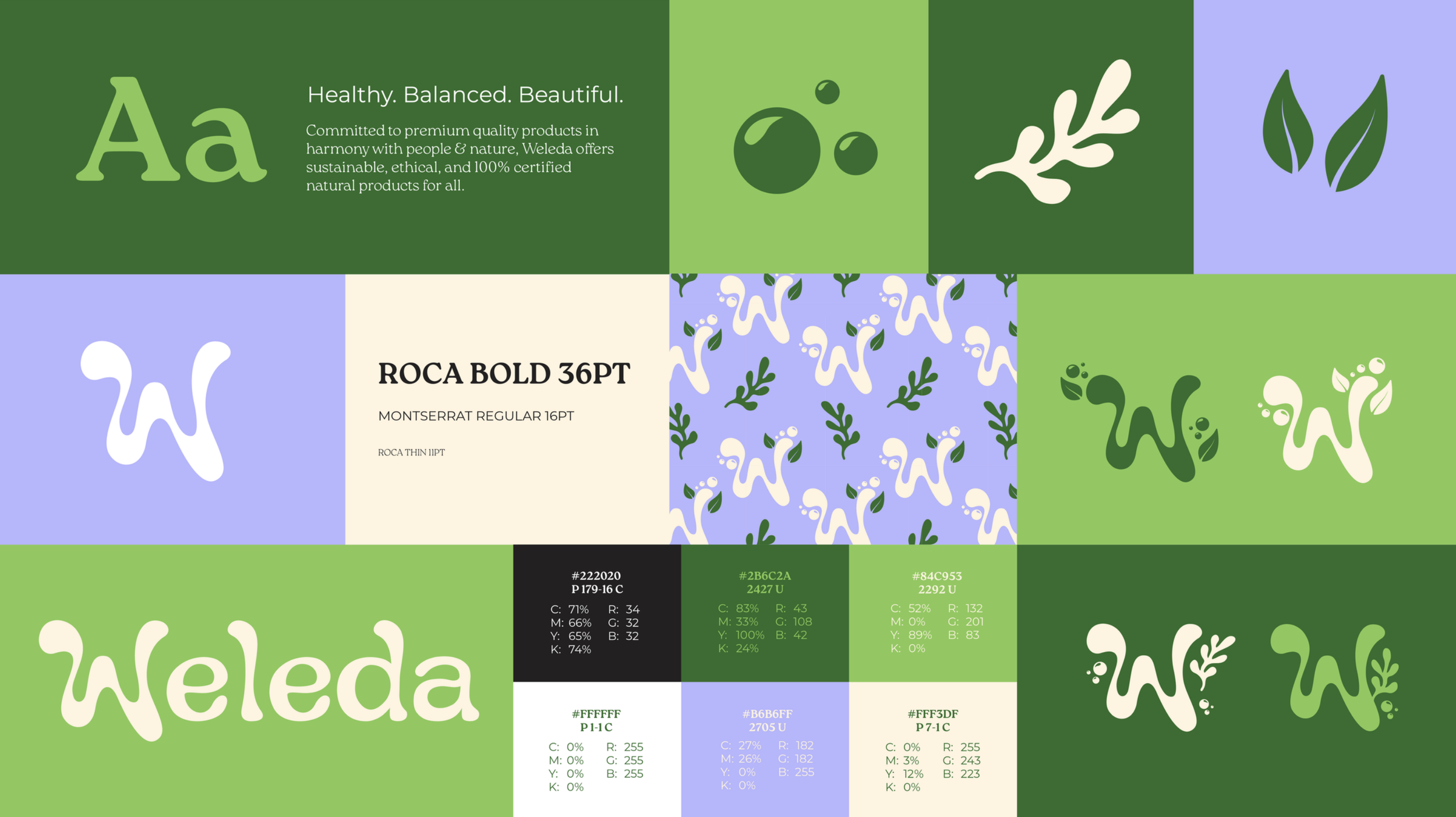
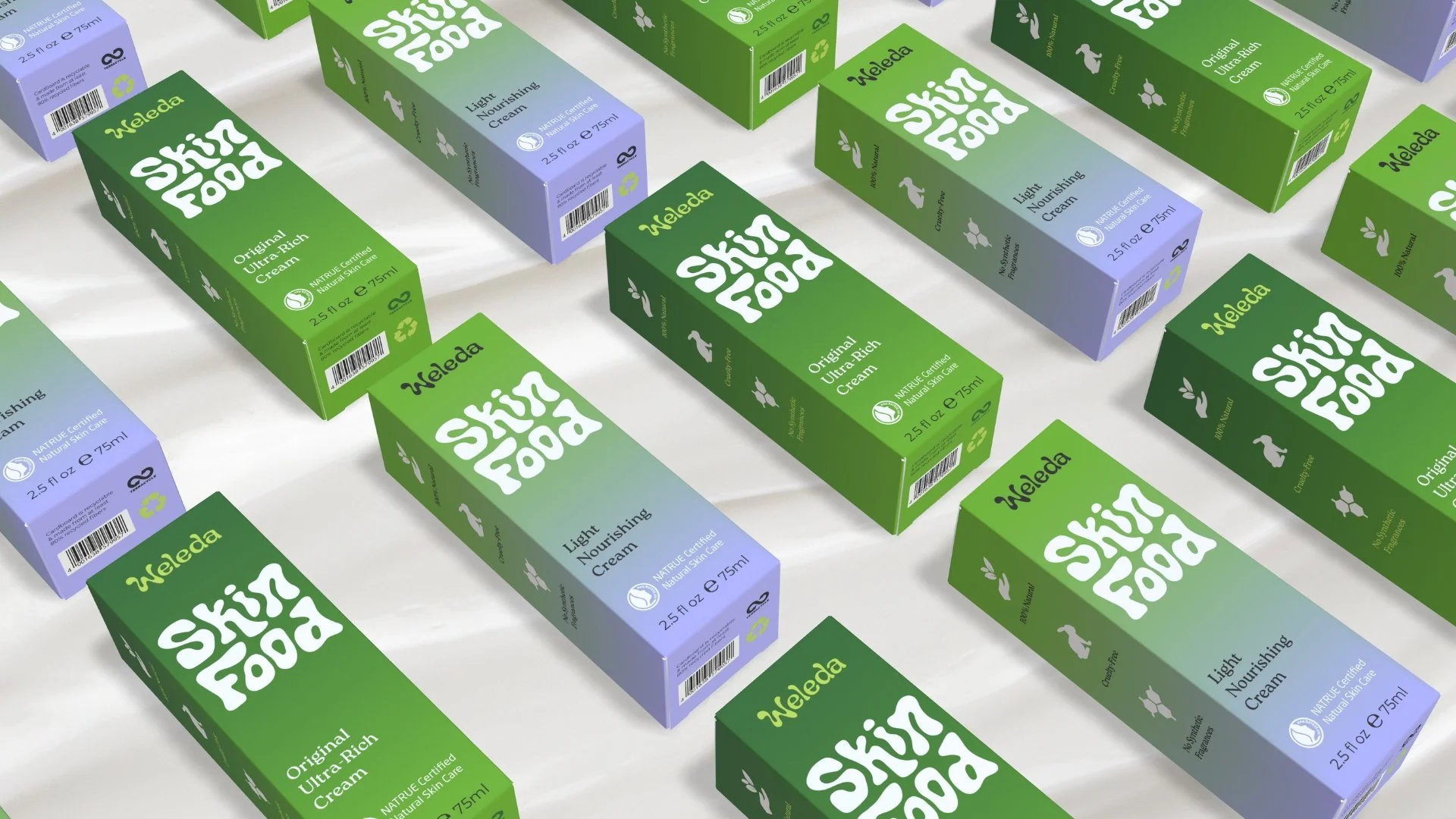
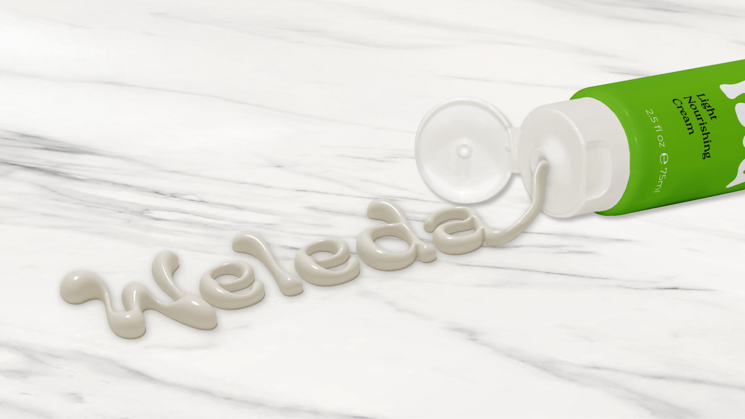
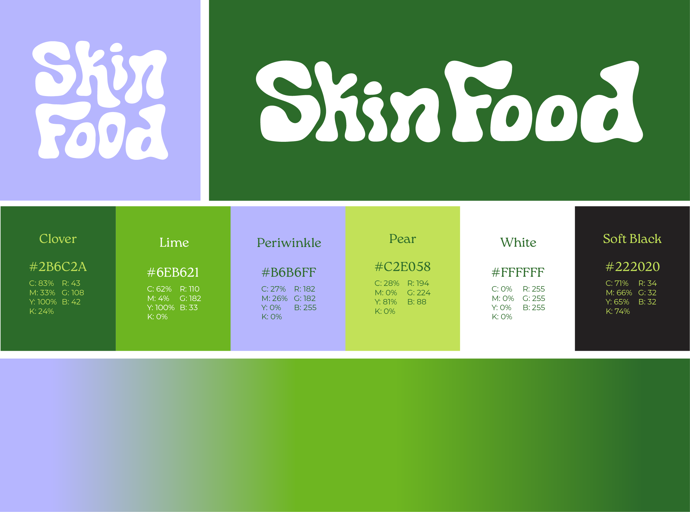
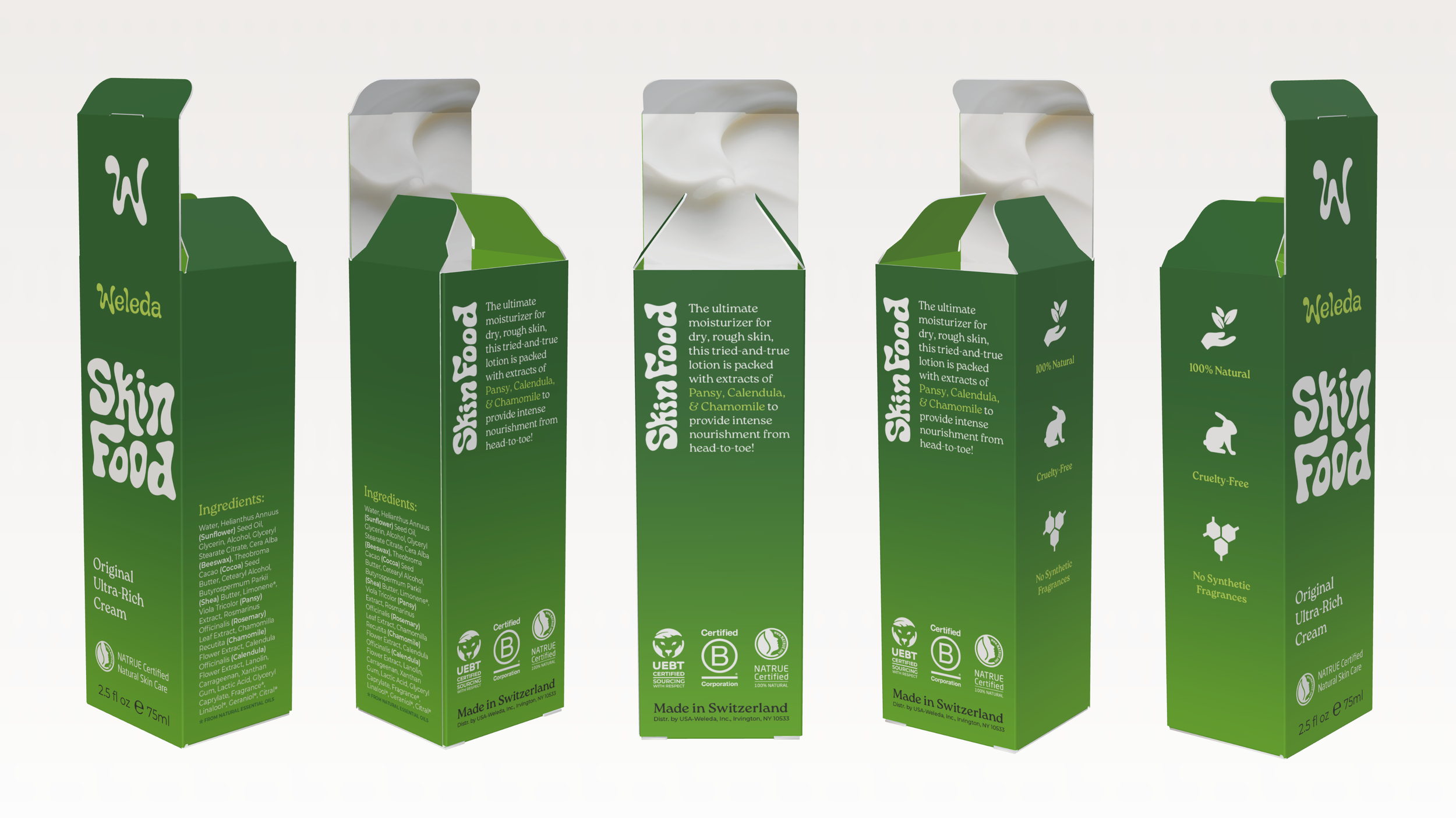
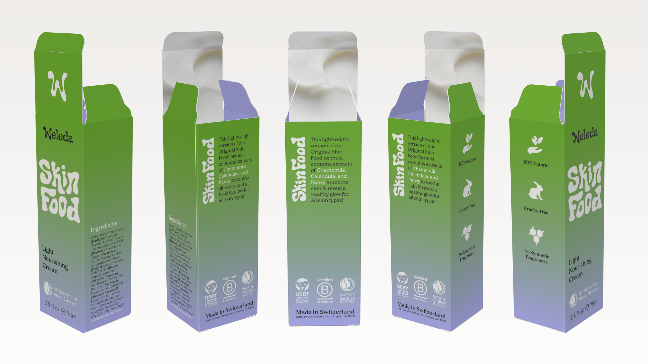
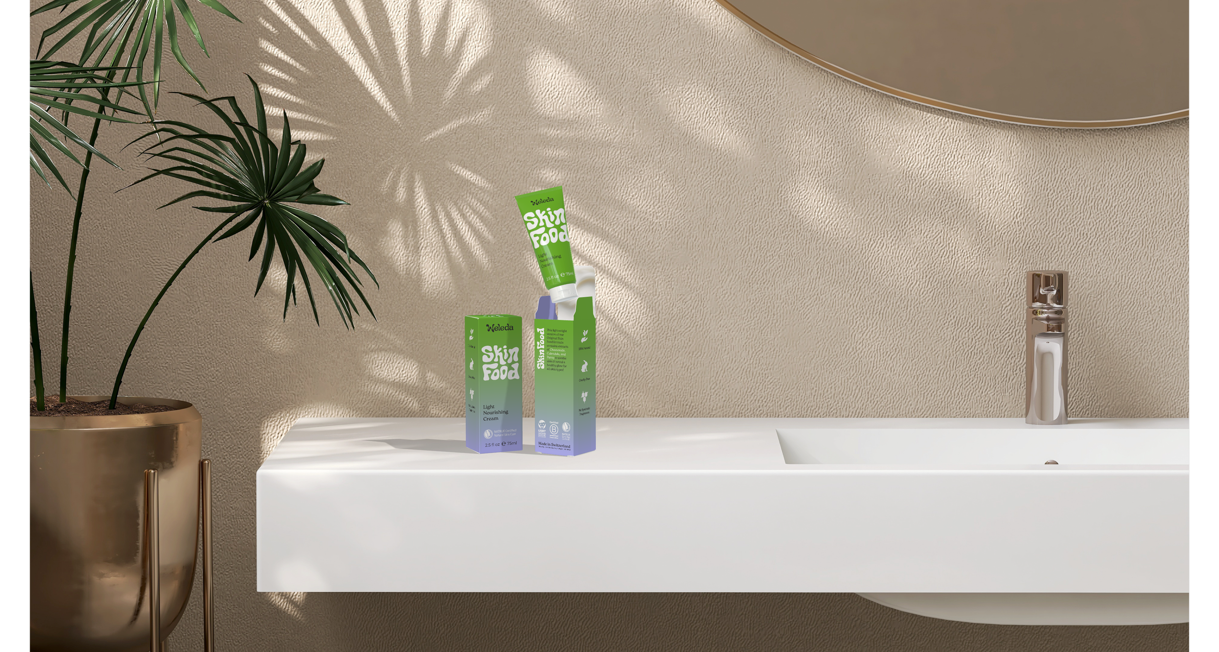
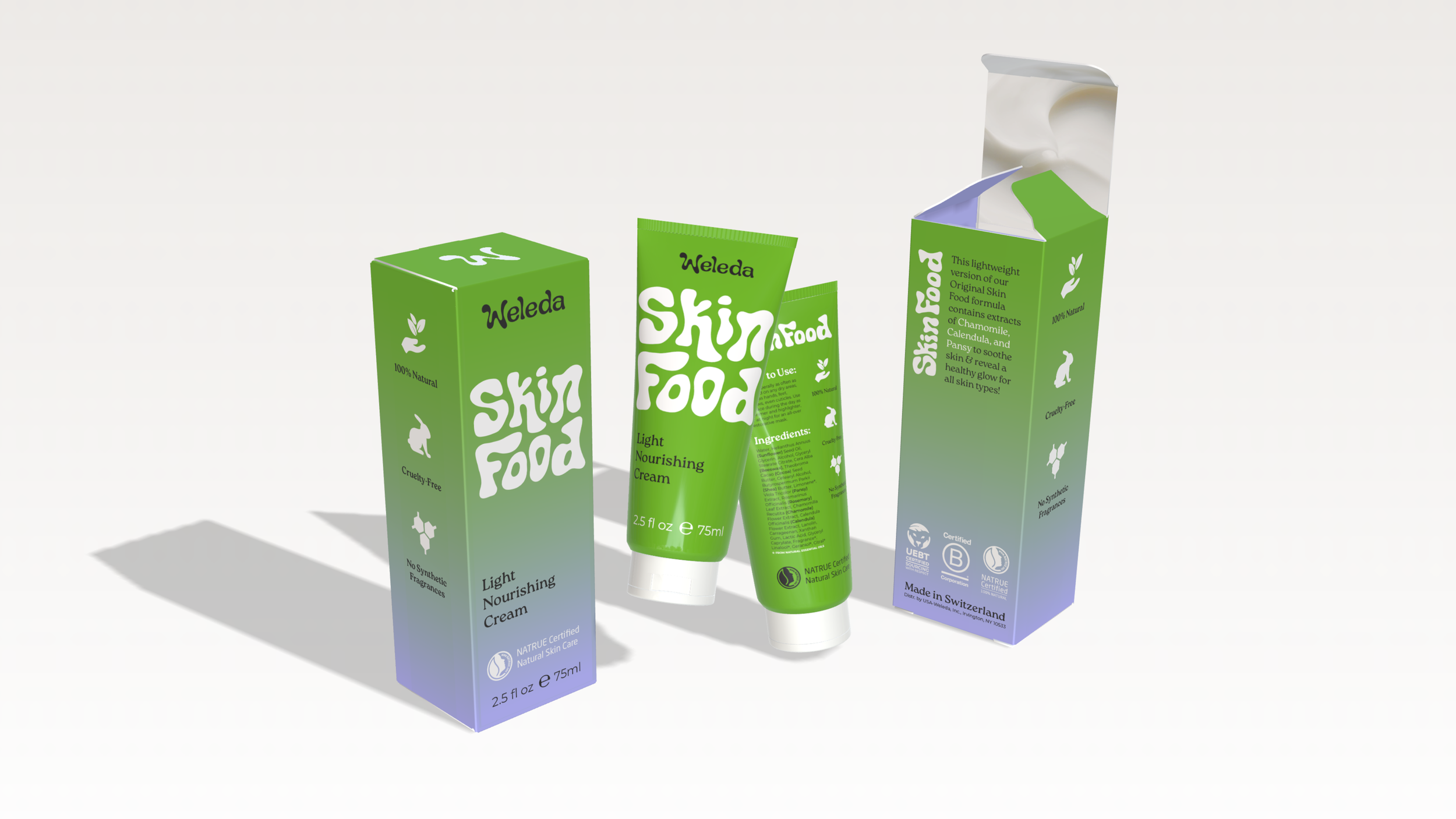
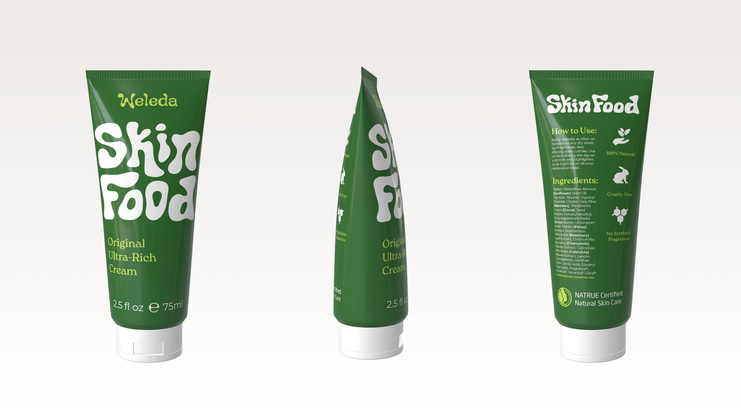
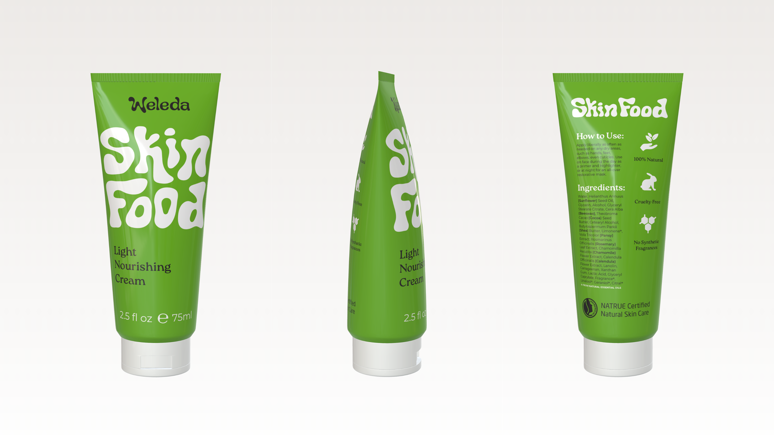
To introduce Weleda's Skin Food to a younger demographic, I crafted a bold, playful logotype with smooth, lotion-like curves. The custom typography enhances brand differentiation on the shelf & adds a touch of 70s-inspired flair that feels both trendy and timeless. The icons, certifications, bold typography, and composition of the packaging allows key product information to be readily accessed and understood, while the vibrant gradients reflect the formulas of the products within: deep, rich clover green for the Ultra-Rich Cream and a fresh lime and gentle periwinkle for the Light Nourishing Cream.
Results:
This redesign reintroduces Skin Food to Gen-Z as a modern cult classic that is easy to spot and recognize on the shelf while staying true to Weleda’s clean, natural, and high-quality values.
Tools Used:
Adobe Illustrator
Adobe Photoshop
Figma
Pacdora 3D Modeling
This is a case study and project concept only, not contracted client work. Creative direction, Skin Food sub-brand identity, product tube and box packaging, website home page, and 3D renders designed exclusively by Brenna Morgan. Weleda branding and marketing were created in collaboration with Claudia Diaz, Makia Thomas, and Amy Coker.