NNEPQIN needed a fresh visual identity that would be memorable, professionally trustworthy in medical settings, and warmly approachable to expecting families while intertwining the ideas of connection, pregnancy, and quality improvement.

Design Process:
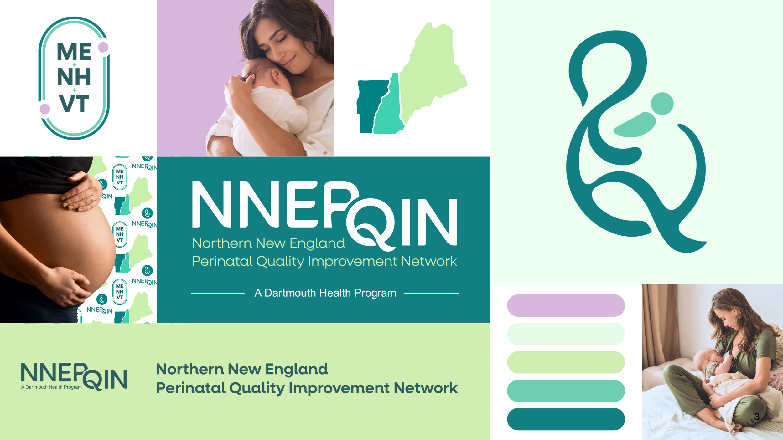
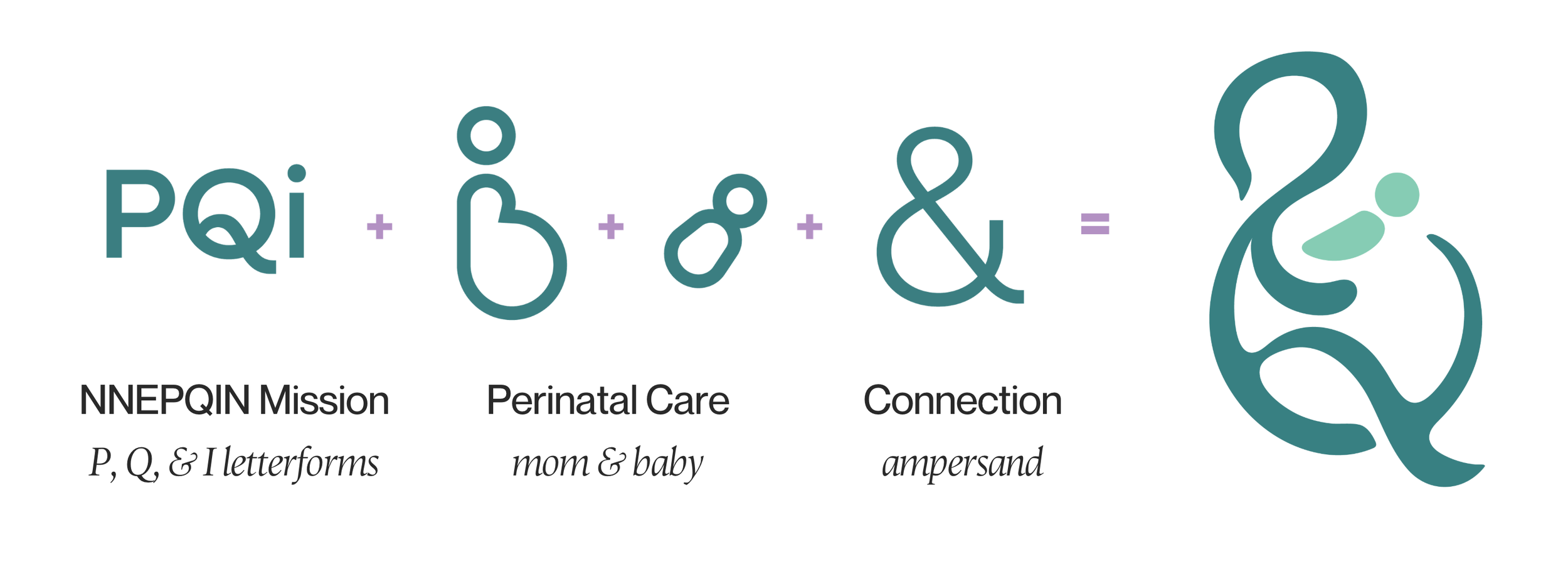
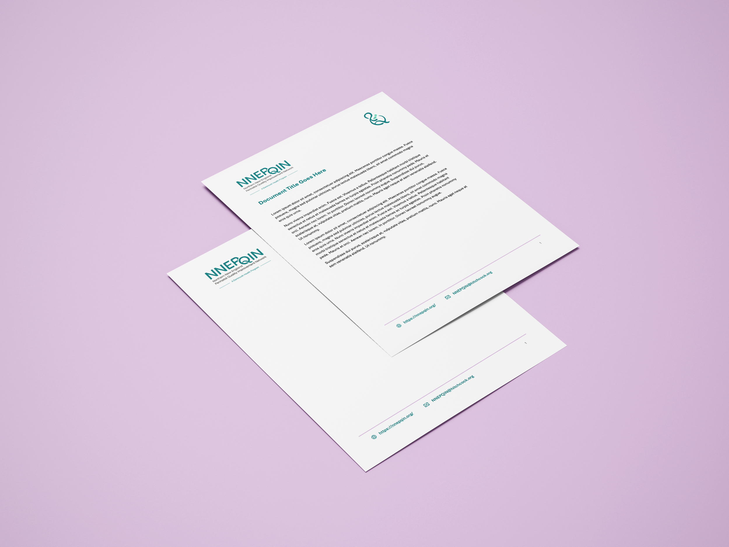
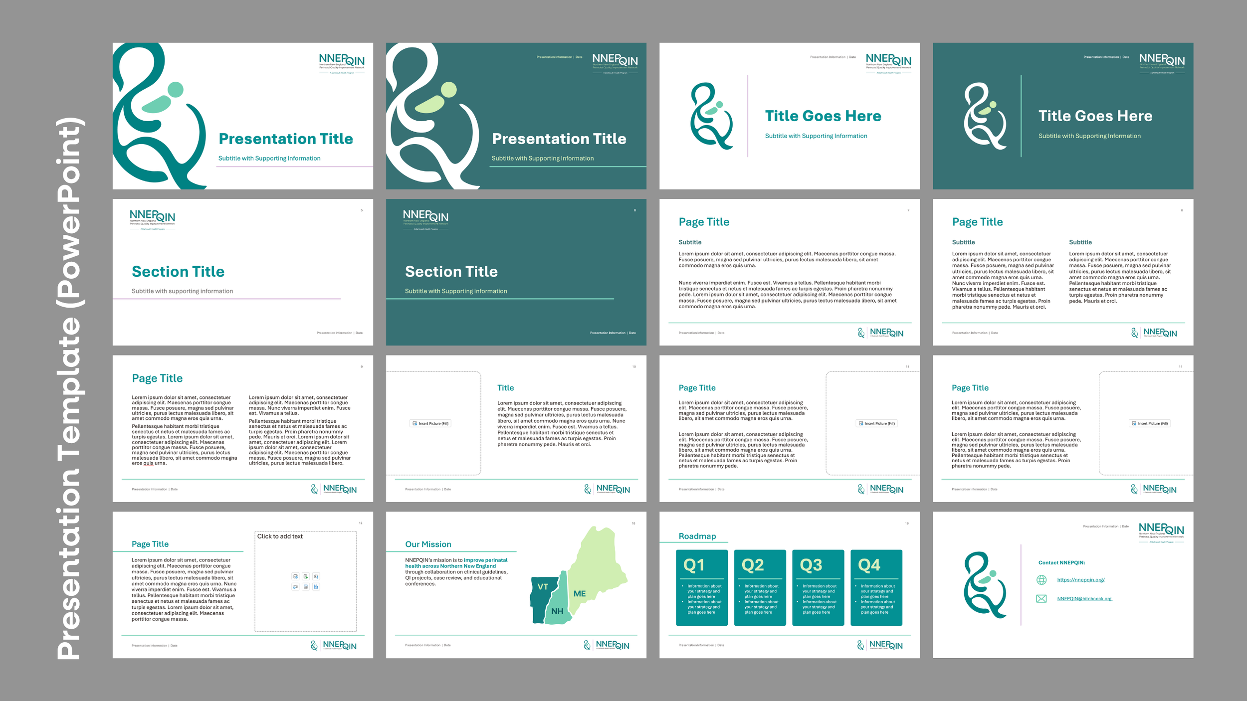
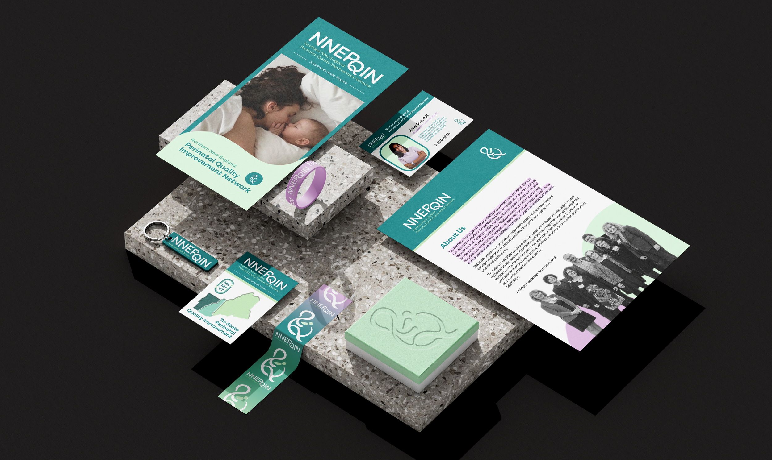
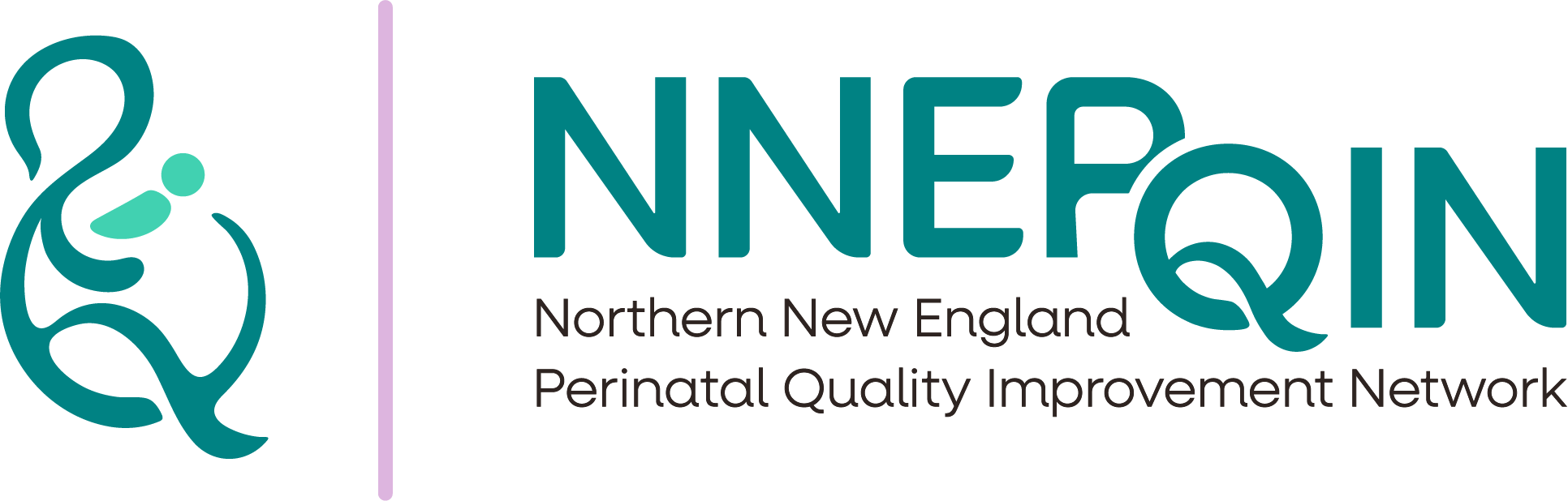
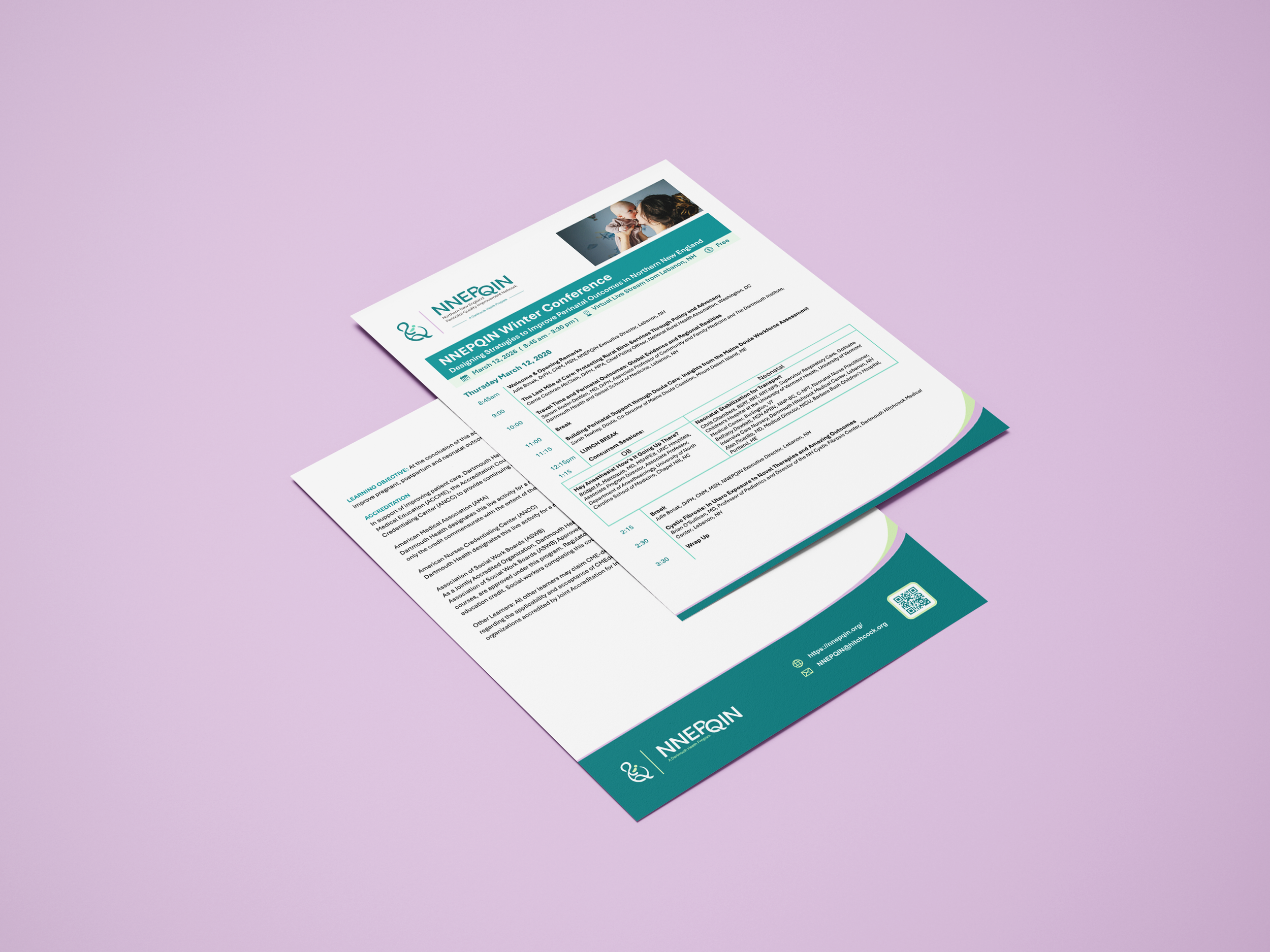
The final design combines the letters P, Q, and I into a flowing symbol of a pregnant mother cradling a baby. At the same time, the shape forms an ampersand (&), visually representing the idea of connection, linking the three states, hospitals, and care providers. The “QIN” is tucked under the “P” for ownability and to aid with pronunciation. Soft, calming colors that convey trust and safety. The full brand kit also includes custom illustrations, patterns, a curated stock photo library, ready-to-use templates for documents, conference agendas, and presentations, a brand style guide, and clear file navigation guides so the team can work independently. Lastly, we built out a fully-functional 17-page website in Wix, set to launch in May 2026.
Results:
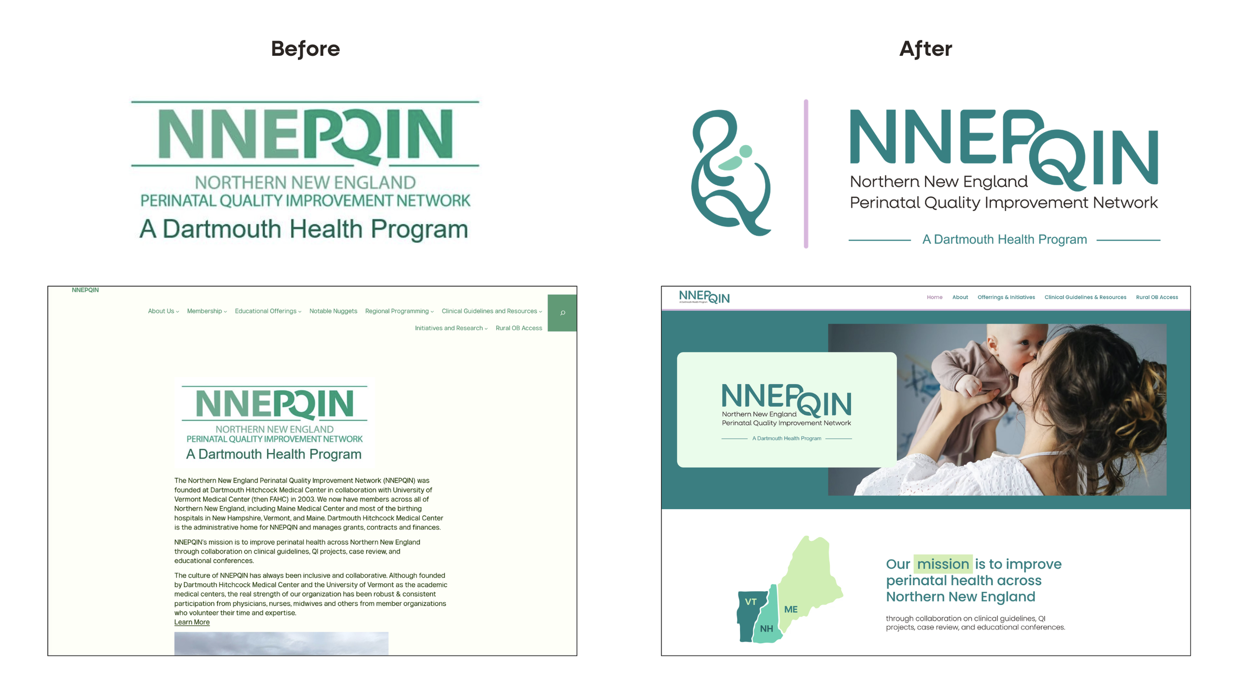
The redesign turned an unknown acronym into a professional, friendly brand that now feels uniquely theirs and instantly recognizable. The new identity has given the organization stronger presence and credibility across Northern New England, with the website launch in May 2026 extending this impact online.
Tools Used:
Adobe Illustrator
Adobe InDesign
Adobe Photoshop
Microsoft Word
Microsoft PowerPoint
Figma
Wix